Last year, I decided to upgrade my studio palette situation.
For years I had been exclusively painting using an eclectic selection of thrift store plates loaded with paint from various travel tins. I am a big proponent of budget solutions and still use my thrift store plates when I want to try a different selection of colours. However, when I spotted a large, relatively budget-friendly, ceramic palette from Meeden, I couldn’t resist. I decided to make the jump to “real” palettes.
The Set-up
I craved a consistent basic selection of colours to use at both my home and co-op studios. I chose a “limited” studio palette of 21 colours – 17 in the large palette, and 4 “underpainting” colours in a smaller handmade palette. In an indulgent move, I bought two of each type of palette. I loaded them up in my first ever livestream. Livestreaming turned out to be lots of fun, so you can now join me (almost) weekly, at 3PM Eastern as I stream whatever I’m working on at the time.
I’ve been using these palettes (well, the home ones anyway…) for a year now. Although there are a few colours I will likely swap out eventually, I have enjoyed working out of a consistent, familiar palette.
Notes on Choosing Colours
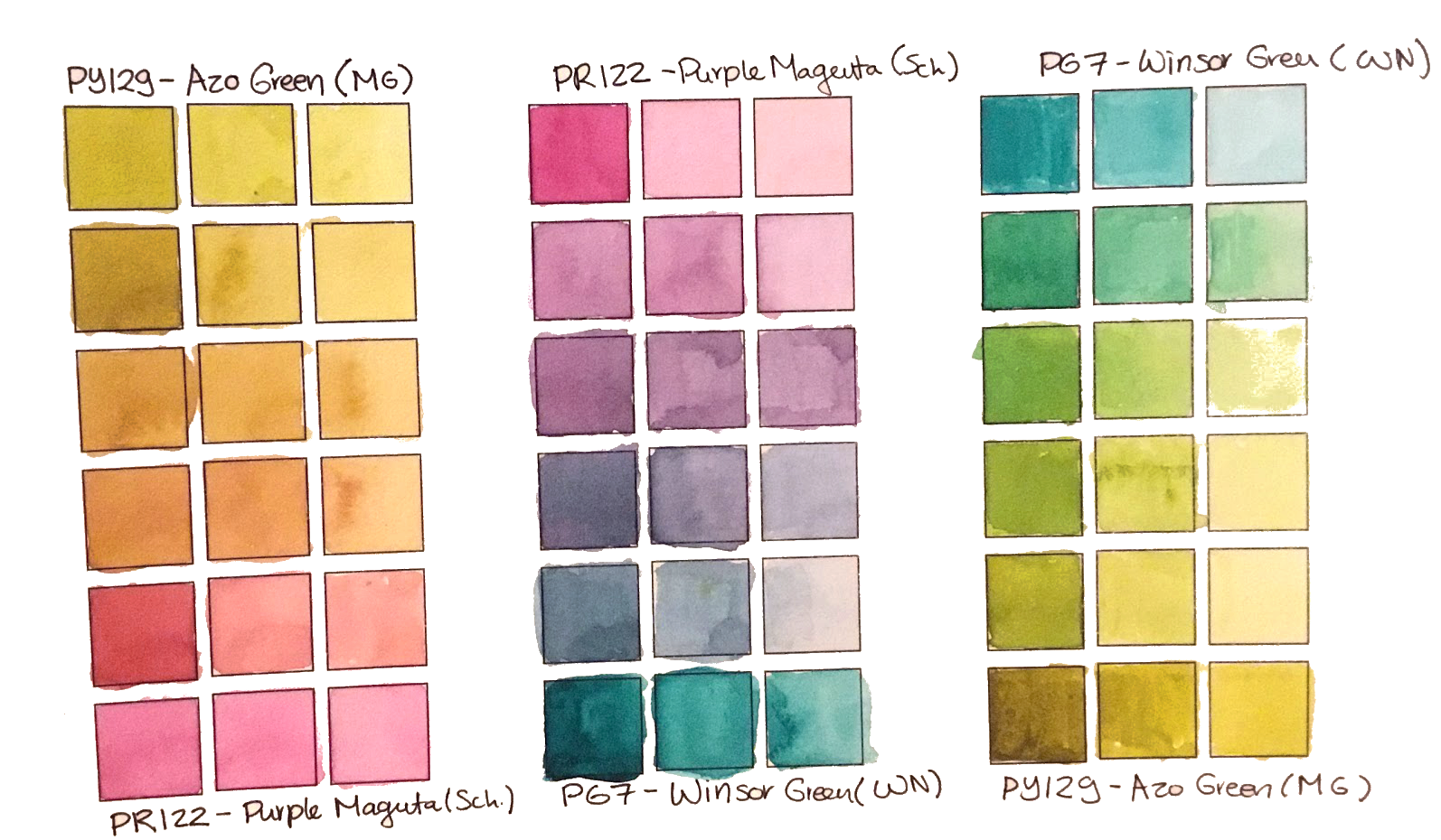
Whenever I share a painting, I get asked what colours I am using. I always say that exact colours/pigments don’t matter that much, and you could achieve similar effects with any range of paints as long as you have a good range around the colour wheel. You do NOT need to choose the same starting pigments, or especially the same brands, to achieve similar mixes.
However, I can’t resist nerding out. I definitely have some strong personal opinions about pigments. I love chatting about my favourite paints. I still love most of the choices I made for my studio palette last year.
On the chart above, I have labelled my paint choices by pigment and common name (-ish), without regard to brand. In most cases, I choose pigments first and have less or no brand preference. For your convenience, I have labelled the exact paints I am using in my home studio palette for you including brand, and a few short words about why I chose them.
So without further ado, here are my choices:
The Main Studio Palette
- PY129 Green Gold by Winsor Newton : A soft, neutralized cool yellow alternative. Brand was what was available locally.
- PY150 Nickel Azo Yellow by M.Graham: My all-time favourite mixing pigment. M. Graham’s version is beautiful, clear and bright a little bit cooler toned than some others, mixing just a little bit green of mid-yellow in tints.
- PO107 Transparent Orange by Winsor Newton: This is a new pigment, currently Winsor Newton is the only brand offering it in tubes. My favourite orange, I find this slightly more powerful and brighter than the more common PO71 Transparent Oranges
- PV19 Carmine (Quinacridone) by Da Vinci: A unique version of the common PV19 pigment, this is a somewhat neutralized, transparent mid-red. This particular shade is, as far as I know, unique to Da Vinci.
- PR122 Permanent Magenta by Mijello Mission Gold: Very slightly bluer than a true primary magenta. This paint is the brightest, clearest lightfast magenta watercolour I have found across all brands and pigments
- PV55 Quinacridone Purple by Schmincke: A transparent, mid purple I thought would be a fun alternative to the more common PV23. Brand was what I happened to have in my collection.
- PB60 Anthraquinone Blue by M. Graham: A deep, moody reddish blue. M. Graham’s version is brighter than most.
- PB29 Ultramarine Blue by M. Graham: A bright, saturated, lightly granulating reddish blue. M. Graham’s version is brighter and easier to rewet than most.
- PB15:3 Phthalo Blue Yellow Shade by Holbein: Closest among modern available pigments to a true cyan. Brand was what was available locally.
- PB16 Marine Blue by Holbein: A more turquoise alternative to the “cyan” primary. Holbein’s version is slightly greener than most other brands, creating more distance between this pigment and the previous PB15:3 choice.
- PG7 Phthalo Green by Schmincke: A powerful, bright mixing green. Brand is what I happened to have in a tube.
- PBk31 Perylene Green by Schmincke: A deep, dark piney green, great for mixing blacks and all kinds of muted mixes. Brand is what I happened to have in a tube.
- N/A Blue Apatite Genuine by Daniel Smith: This one paint on this palette I’m eager to swap out asap. I wanted a deep granulating blue, but find this version gummy and don’t like how it mixes. Daniel Smith’s recent response to scientific analysis of their Primatek range colours has further turned me off the brand and Primatek line especially. I will likely replace this with a cool brown tone, which I feel has been missing from this selection.
- PR233 Potter’s Pink by Schmincke: A soft, heavily granulating muted pink. This isn’t the sort of colour I would expect to like, but I find it immensely useful for adding depth to mixes and soft texture to all kinds of subjects. PR233 is a notoriously hard to rewet pigment, Schmincke’s version rewets like a dream.
- PR206 Madder Brown by Schmincke: A non-granulating transparent, pinkish light brown that that lifts surprisingly easily. I find this one surprisingly versatile in mixing, muting down my otherwise loud colour choices. Schmincke’s version is lovely, and the german name “Krapp Braun” makes me giggle.
- PR101 Transparent Brown Oxide by Daniel Smith: A powerful, orangey brown shade with a pronounced granulation. I was aiming for an all-purpose dark earth colour. I’ll experiment with different options and brands when I run out of this one.
- PBr7 Monte Amiata Natural Sienna by Daniel Smith: This is my “raw sienna” spot. Monte Amiata is brighter and more transparent than some raw sienna versions, which appealed to me. Once I run out, I will be refilling this slot with my own raw sienna paint made from Kama pigments.
Supplemental palette/Underpainting Studio Palette
- PY184 Bismuth Yellow by Winsor Newton: An almost neon, semi-opaque lemon yellow with well behaved flow that works well for underpainting. Brand is the first one I tried, recommended to me in a workshop by John Pastoriza Pinol
- PR209 Quinacridone Red by Daler Rowney: PR209 is a nice coral red tone, less punchy than some other quinacridones, making it ideal for underpainting and delicate layers. I got a great clearance deal on a Daler Rowney tube several years ago.
- PV62 Cobalt Violet Hue by Schmincke: Not a cobalt pigment at all, but rather a new synthetic violet apatite structure which has a similar pronounced granulation to some cobalt violets and adds interesting dusky tones to mixes, or underpainting for areas in shadow. This pigment is unique to Schmincke.
- PG50 Cobalt Turquoise Light by Winsor Newton: I adore most versions of Cobalt Teal type colours – it really is a unique and vibrant pigment. Winsor Newton’s version is well behaved, easy to rewet, smooth, and has a slightly greener tone than most.
What’s Next?
I’ve been quite satisfied working with this range of colours for the past year or so. I expect to continue to use these palettes with only infrequent, gradual changes and replacements to individual colours as my preferences and needs change.
However, as I was fetching an affiliate link for the Meeden palettes, I came something really neat. I may have something interesting to share with you soon….

THIS POST CONTAINS AFFILIATE LINKS. LEE ANGOLD IS A PARTICIPANT IN THE AMAZON LLC ASSOCIATES PROGRAM, THE DA VINCI PAINT CO. ASSOCIATES PROGRAM AND THE JACKSON’S ART AFFILIATE NETWORK. THESE ARE AFFILIATE ADVERTISING PROGRAMS DESIGNED TO PROVIDE A MEANS FOR SITES TO EARN ADVERTISING FEES BY LINKING TO PRODUCT LISTINGS.