Over the past few years, I’ve written a number of blog posts and videos exploring my colour choices in the watercolour palettes I use every day. Over time, I’ve settled into fairly consistent favourite pigments and paints. However, I continue to love exploring and experimenting with new paints, and sometimes my preferences do change and evolve.
I recently refilled/reorganized two watercolour palettes I published tours of on this blog. I made a few small changes to my colour selection in my Atlantis traveling studio palette, and completely overhauled the selection of paints in my tiny bijou box Discovery palette.
I thought it would be fun to show you how my paint preferences and process have evolved in the past few years by comparing my recent update to my original choices.
Atlantis Palette, Then and Now
My Atlantis palette is a collection of 25 pans (14 full pans and 11 half pans) squeezed into a special edition Schmincke tin.
I originally picked this selection of colours as it would allow me to carry all my favourite paints/pigments, a selection of other common paint colours (useful when teaching classes), and still has room for a few extras to experiment with, all within a fairly portable box I could comfortably carry with me wherever I go. You can see the original pigment list here

I still use this palette in a very similar way. Many of my favourite colours remain the same as 2 years ago, and many pans have been refilled with the same pigments. This colour selection has remained nearly unchanged for 2 years and has served me well.
However, in my recent update, I have changed about 1/3 of the colours and am looking forward to working more with this new set. In the next section I will discuss which colours I swapped.
Main Palette Additions and Replacements

PY 184 Bismuth Yellow (replaces PY 175 Lemon Yellow) Cool yellows trouble me. I’ve yet to find a cool yellow I really get along with, but sometimes they are necessary. I had chosen PY175 for transparency, but disliked how it felt on the brush and found it low tinting. While much more opaque, Bismuth Yellow (a recommendation from John Pastoriza Piñol) is nearly neon, strongly tinting enough that it still works in glazes, and much less unpleasant to work with.
PY139 Iso Yellow Deep (replaces PY 153 Indian Yellow): Although I still have a substantial stockpile of the discontinued PY153 pigment, I’m happily exploring warm yellow alternatives. This is a great option from local paintmaker Selah Paint Company.
PBr7 Monte Amiata Natural Sienna (replaces PO49 Quinacridone Gold): Another substitution for a discontinued pigment, which I also have a stockpile of. The Natural Sienna has a pleasing natural granulation, something I have found myself appreciating more often than not recently.
PBr23 Transparent Brown (replaces PO48 Quinacridone Burnt Orange): This is perhaps the change I find most surprising, as I once considered PO48 my favourite pigment, but recently when I need a muted orange I have found myself mixing a drop of violet or brown into my bright transparent orange. A richer brown seems potentially more flexible for mixing.
PBr7 Burnt Umber (replaces Raw Sienna): I love raw sienna, but rarely reached for it, and with the addition of Monte Amiata Natural Sienna, rarely would likely become never. I’ve instead added chocolatey burnt umber, a colour I’ve always loved but never made room for in my palettes
PR233 Potter’s Pink (replaces PR178 Perylene Dark Red): In marked contrast to past Lee, been loving playing with soft, powdery granulating pigments recently, and have fallen in love with Potter’s pink, taking the place of a pretty red I rarely used. It seems odd for a botanical artist to not have a pure red in my palette, but it’s simply not a colour I ever feel I need.
PV29 Perylene Violet and PBk31 Perylene Green split (replaces PV55 Quinacridone Purple): I use these pigments frequently together to mix a dark black/shadow mix, and used to have them in a split full pan together. Since I didn’t use the very pretty Quin Purple barely ever, I decided to split my workhorse “dark” paints to add flexibility.
PV62 Cobalt Violet Hue replaces Indigo: Schmincke’s cobalt violet hue is actually an apatite compound (strontium phosphate violet), with characteristic strong apatite granulation. A brand new addition to my collection which I’m eager to experiment with.
Blue Apatite Genuine replace PB71 Zirconeum Cerulean: Similar strong granulation, but I like the dark and moody blue apatite better than the pasty zirconeum as a standalone colour.
Aquarius Green replaces PY129 Green Gold: Roman Szmal sent me this gorgeous green (his personal favourite) paint as a sample for review last year. I love it but hadn’t used it, so decided to put it in my palette to remind myself to play with it. I’ll miss PY129 a lot, though and hope to squeeze it back in soon.
PB29, PR177. PG26 Przybysz’s Grey replaces Iron Glimmer Hematite: Another unique and beautiful granulating mix gifted from Roman Szmal I’m looking to experiment more with. This one replaces another dark neutral with interesting granulation, albeit in a different colour.
Old Faithful Colours that remain unchanged
The following colours remain largely unchanged from my original Atlantis palette. You can read my colour descriptions in that post:
PY150 Nickel Azo Yellow
PO71 Transparent Pyroll Orange*
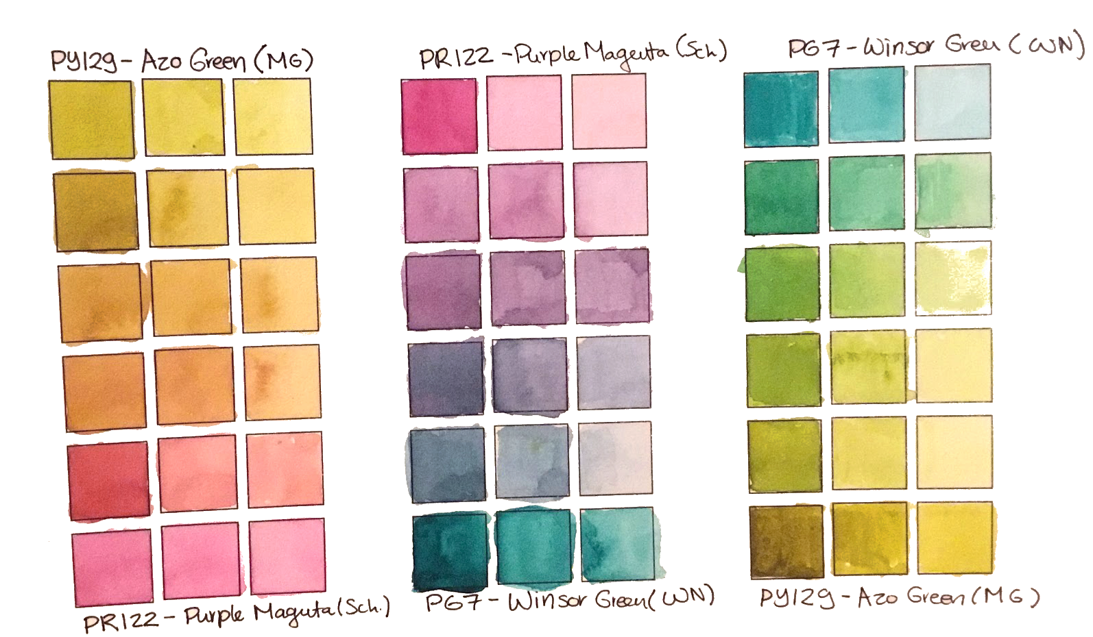
PR122 Quinacridone Magenta
PR242 Geranium Red
PV19 Quinacridone Rose
PV23 Dioxazine Purple
PB29 Ultramarine Finest
PB60 Indanthrone Blue
PB15:3 Phthalo Blue Green Shade
PB16 Pththalo Turquoise
PG50 Cobalt Teal
PG7 Phthalo Green Blue Shade
PV29 Perylene Violet
PBk31 Perylene Green
Hematite Brown
*(will be refilled with extremely similar PO107 Transparent Orange by Winsor Newton when empty)
What do these colour changes mean for my art practice?
I was surprised that I chose to swap so many colours at once, in a palette that has served me well for years. However, looking at my selections for smaller palettes and individual paintings, it makes sense. My core 10 or so most used pigments do remain virtually unchanged with every palette change or new palette over the past few years. I just enjoy playing with other paints, and these are far more likely to keep changing through my life.
I’m glad to see my colour sense evolving, stabilizing and refining over time. Have you noticed changes in the colours you choose and use over time?