The Green Problem
Many people find it difficult to mix and paint natural-looking greens. Two common complaints I hear from beginner watercolour painters are:
1) their green mixes are too garish and unnatural looking, or;
2) their greens look flat.
In this post I will discuss the strategies I use for mixing greens to ensure that my green subjects always look lively and natural, and never garish.
What makes a realistic, natural-looking green?

Bright, springy greens in this watercolour illustration of spring onions
In my experience, green colours in nature have the following properties:
- Natural cool greens (that is, greens which are more blue than yellow) are often muted. Very bright, saturated cool greens (such as the common Phthalo Green) are the most likely to be seen as “garish”or “unnatural”.
- Natural warm greens (that is, greens that are more yellow than blue) may be extremely bright in young plants or when light shines through. However, muted mossy warm greens are also very common, and often occur alongside other, brighter greens.
- Greens in nature show a huge amount of variation in tone, colour temperature, saturation and texture. All greens will look unnatural in flat, even applications.
If you remember the three items above, you’ll be all set to start mixing realistic looking greens.
Why not just use a tube of green paint?
Paint brands sell a dizzying array of green watercolour paints. Surely at least some of the tubes of green paint are “natural” looking, and could be used straight from the tube/pan. There are two problems with depending on tube paints for greens.
The first problem with tubes of green paint is that there are relatively few green pigments. The green pigments that do exist tend to be either very bright, cool greens (phthalo green, viridian) or very opaque or granulating (chromium oxide green, cobalt green). Most tubes of green paint are just a pre-mixed blend of a yellow pigment with a blue or phthalo green pigment. There’s nothing inherently wrong with multi-pigment tubes. However, you can achieve a more flexible range of effects for cheaper if you buy the single pigments used and mix them yourself.
The second problem is that greens in nature are very diverse and variable. It’s very tempting to look at the world around you and see all sorts of green shades that are similar to a pre-mixed sap green and paint them all in the same shade. In the horse chestnut illustration below, I deliberately created a flat, “colouring book” style illustration by using only sap green from a pre-mixed pan for the main sections of the leaf. There’s nothing inherently wrong or unnatural with this colour. The green doesn’t look natural in this illustration because there is very little hue and colour temperature variation in the greens.

Horse Chestnut Leaf Illustration – Using Sap Green and Perylene Green only, yielding a flat “coloured in” style
You can use premixed greens if you would like. Just remember to mix in a little bit of yellow, blue or another green and vary your mixes as you work across your piece.
What colours can be used to mix natural-looking greens?
Mix rich and varied greens from various combinations of paints in the orange/yellow to blue/violet area of the colour wheel, including other greens.
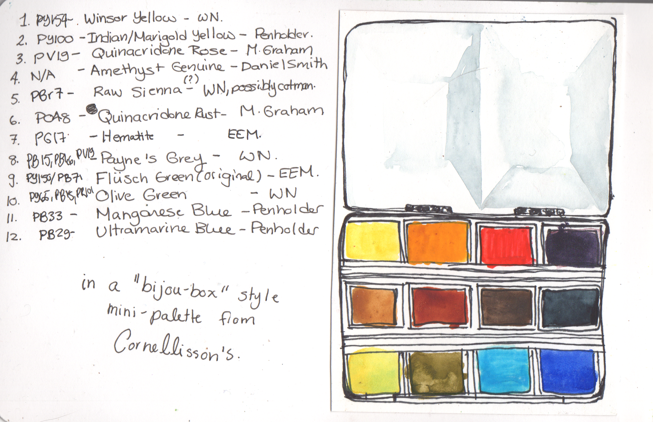
A great way to get to know your palette and mixing possibilities is to paint a basic mixing chart as I have done below. Across the top, I selected a number of blue-green, teal, blue and blue-violet pigments. On the vertical axis, I selected yellow, yellow-orange, and brown/rust (muted yellow/orange) pigments. Match up the rows and columns to see the greens each combination can mix.
Each combination of two paints mixes a large range of different greens. In the bottom left of each mix, I created a saturated, yellowish mix of the two colours. In the top right, I mixed a blueish mix. The top left is a saturated even mix. Finally, I used a watery wash to show unsaturated mixes in the bottom right corner of each mix.

Watercolour Mixing Chart – Greens mixed from Yellow to Orange and Green to Blue pigments
Brighter colours that are closer together will create brighter mixes. Muted colours, or those that are further apart, will mix greyish, mossy, muted greens. Remember the rules for natural-looking greens we discussed at the top! Make sure you can mix a range of greens, including brighter yellow greens and muted cool greens.
Pigment Recommendations for Mixing Green
Most green shades appear several times in different spots on my mixing chart. This is great news! It means that you may already be able to mix many greens using the paints you already have. I strongly suggest experimenting with the paints you own and love to find some favourite green mixes.
However, over time I have discovered some reliable mixes that I’m eager to share. If you’ve been following me for a while, you may already know what’s coming:

Nickel Azo Yellow <3 <3 <3
No matter what I’m painting, my trusty Nickel Azo Yellow (PY150) nearly always finds it’s way onto my palette. This super-saturated, completely transparent yellow is a slightly warm, muted colour in masstone and a beautiful clear, mid yellow in tints. I find it useful for painting yellow subjects, red subjects, brown subjects, orange subjects…and especially for mixing greens.
In fact, I mix nearly all my greens using PY150. Because it is so transparent, greens mixed with Nickel Azo yellow appear clear and vibrant on the palette and glaze beautifully.
Green Mixes with PY150
In the chart below, I have mixed a wide range of greens by combining PY150 with a number of green and blue pigments. As you can see, you can mix an incredible range of different green shades using just this one yellow paint and different blues:

Green Mixes from Nickel Azo Yellow
When mixed with bright greens, teals or greenish blues, PY150 mixes a number of very bright, springy yellow greens. These spring green shades are not *quite* as neon as those you might achieve using a lemon yellow such as PY175. However, they are usually bright enough for me. When you mix PY150 with cooler, blue-violet tones, you’ll see a range of muted mossy and forest greens appear.
Perhaps the most interesting effect is when you mix PY150 with a blue or green that is warm, but muted. Two examples of this are PBk31 Perylene Green, or PB27 Prussian Blue. In these cases, the green mixes are fairly bright in the yellow-green range where the yellow makes up most of the mix, but are more muted towards their blue side. This makes the greens look more realistic and natural! In some cases, this means I can get away with creating all of my greens in a piece using only one yellow and one blue/green, and still achieve a natural effect. You’ll see this same effect if you mix prussian blue or perylene green with your own favourite bright yellow.
Toning down greens that are too bright
The last strategy I use for creating realistic greens is to tone down most of my bright, middle-to-cool greens. Even bright springy green subjects will have deeper, cooler greens in their shadowed areas. However, these areas will be more muted as well as cooler.
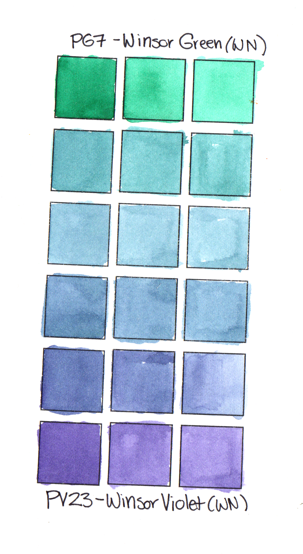
I make sure to add a little bit of a complementary red, magenta or violet shade to any areas of the painting where a cooler green tone will appear. I use whatever warm shades I already have selected for the piece for this purpose. The mixing chart below, created for a painting of a very blue cabbage leaf, show how I mixed shades of muted greens and teals by mixing my phthalo green with violet and magenta shade

Mixing blues from green and violet + other mixes used in blue cabbage leaf watercolour painting
Wrapping it all up
To summarize all the above information, I have three tips to help you mix your best greens:
- Create a variety of green shades by incorporating different blues, greens and yellows into your green mixes. This variation will make your painting looks more natural and add interest.
- Use a bright lemon or mid-yellow (such as PY150 Nickel Azo Yellow) mixed with a bright green or turquoise to make clear, bright spring greens. Use violet or muted blues to mix muted greens.
- Mute any bright, cool greens with a complementary shade such as yellow or violet.
Have fun mixing greens!