What is artistic style? Do I have one? Should I care?
What is artistic style? Do I have one? Should I care?
As a new freelance artist and illustrator, it is very hard to resist getting sucked into worrying about "artistic style".
There's no denying that creators with a distinctive and cohesive "look" to their pieces have a certain edge in selling their work - viewers who are attracted to one of their pieces will likely enjoy all of them. The repetition of showing visually cohesive work tells a story and creates a brand. People will recognize an artist with a distinctive style by their work, even without seeing a signature. Customers will feel like they are purchasing a true insight into the artist when they buy a piece that is part of a larger visual narrative.
But what is artistic style, and can it be cultivated?
Until recently, I believed I didn't have a really cohesive visual signature. Although I paint realistic, botanical and scientific subjects and have favourite media, I didn't feel like my work had any specific attributes that consistently set it apart. Botanical and scientific illustration is still a very broad field. My composition, the colours and lighting in my work, the media I chose to use, the level of detail and choice of focus, the scale I paint at, even my choice of subjects seemed to vary quite a bit from piece to piece.
Some have commented on my consistent choice of botanical/natural science subjects, but that is a field, not a specific style. There are artists within my field who truly stand out with natural science illustrations that are recognizably theirs. Jess Shepherd springs to mind - her moody, sharply shadowed, larger than life paintings are recognizable regardless of her chosen subject, and her fascination with leaves in her Leafscape project reinforced her consistent look with a consistency of subject. By contrast, Lizzie Harper, another botanical watercolour painter, makes paintings with a completely different, but equally distinctive look. Lizzie's paintings are very sharply stylized, with saturated, bright clear colours applied in precise layers.
It hasn't been until the past few months that I've started to see some really unique patterns emerging in my body of work. When I hang my paintings up in shows now, there are very visible repetitions in my choice of colours, of subjects. The most striking example was a few months ago, with much of my work hanging in three other shows (humblebrag alert), when I handed my studio mate five pieces I still had at the studio. She hung up the display shown below, and I was struck with the many different ways the pieces echoed motifs found in one another, from colours, to patterns, to textures.
 Emerging Style: A cohesive collection of my artwork. Black and White, Sage Green and Teal, complex textures and mathematical patterns in botanical illustration
Now, of course, my full body of work also contains some pieces that would not fit as cohesively with the ones above, they just happened to be hanging elsewhere at the time. Some of my art pieces were (and are still) hanging at Rawlicious KW - I selected a collection of brightly fruit and vegetable portraits to display at this funky, raw vegan restaurant.
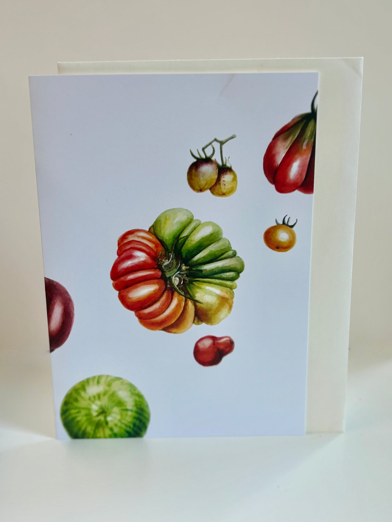
The art at Rawlicious is also very cohesive with itself, but in a different way - featuring bright, extremely saturated colours, particularly vibrant greens, rose and orange colours and quirky, repeating compositions. I like to focus in on little details like the tangled masses of roots on certain vegetables or the scars and markings on heirloom carrots.
I sincerely believe that true, individual style is something that emerges organically, through regularly drawing a range of subjects, varying media and style and exploring things that interest you. until your own signature starts emerging. In my opinion, forcing yourself to make art that looks a very specific way (ie very closely based on your favourite artist) can be counterproductive. Instead on honing in on what makes your art yours, you'll end up with a watered down version of someone else's look.
In the months since these pieces were made, I have continued to make art, mostly botanical and scientific, but also sometimes urban sketching, life drawing or other artistic stretching.
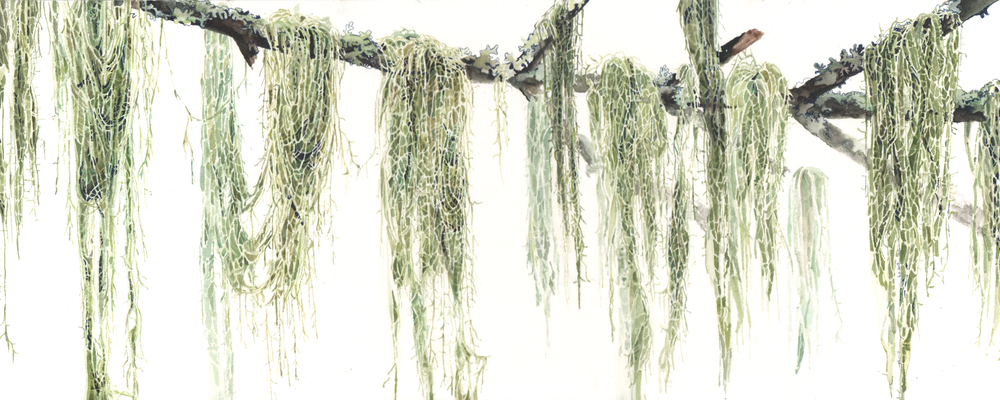
I have noticed that most of my recent art seems to complement and refine the themes I identified in the two collections above. My pieces tend to focus heavily on interesting textures and pattern - I love painting lichen, roots, dried curled up leaves, lumps and bumps, and things with interesting repeating mathematical patterns such as spirals or symmetry. I like using contrast to explore textures (which made inktober a lot of fun). I also often love incorporating bright colours (which made inktober quite dreary after a while).
 Airboss Rubber Factory
Perhaps unusually in a botanical illustrator, particularly one who loves colour, I don't often find myself drawn to paint floral subjects. I prefer to find the beauty in overlooked natural subjects such as twigs, lichen and weirdly shaped vegetables. The same sort of pattern has started to emerge in my choice of non-natural science subjects. For example, my favourite urban sketch subjects tend to be old factories or complicated market stalls, rather than grand landmark buildings.
I've made a conscious decision to not try to force myself to choose between these preferences or limit myself to them. I'm not sure how my love of vivid colours will balance out with my love of dull-coloured textural subjects and monochromatic approaches over time.
I am continuing to paint whatever subjects interest me, fit within current projects or I am commissioned to paint.
 Orange and Spice - Watercolour on Paper
I am excited when I notice some of my recent illustration bridging the gaps between different interests and patterns in my art. My holiday card design of orange and spices is full of bright, saturated colour, but also incorporates the cool 5 point rotational symmetry of star anise.
I also really enjoyed painting both the bright blooms of the iris to the right, as well as the papery dry petals with their beautiful textural quality. I was amused when my studio mate, looking at my reference photo, taken months ago, commented "Of course, you had to pick the deadest most twisted up one". It was a funny reminder that I think of my subjects, even (especially?) floral ones, in my own unique way.
I am excited to see how my visual style continues to develop and solidify! Perhaps this time next year I'll have a new and more developed perspective on my own visual goals!

