Relative Colour vs. Local Colour
Relative Colour vs. Local Colour
mine, your mind jumps to "yellow". The colour you are picturing when you think of a yellow banana is the local colour of a banana.
When you look at a banana, your eyes do not see the the local colour yellow. Instead, your eyes see a bunch of different colours. These influenced by the light hitting the banana, the reflected colour of surrounding objects and surfaces, and more. These are the relative colours of the banana.
Our brains are very powerful. They process the combination of relative colours our eyes sense, and allow us to interpret objects as their local colour. We can combine our knowledge of local and relative colour to create more effective illustrations.
Colour choices
Artists make choices about how to represent colour and light. These choices can be conscious or unconscious. When we create our first art pieces, most of us colour our subjects in a single local colour. A banana becomes a flat yellow crescent shape. Some artists deliberately focus on local colour, drawing attention to other aspects of their subject.
To create depth and realism in our art, most artists choose to include some aspects of relative colour in our art. We use darker and cooler colours in shadow areas. We leave bright highlighted areas white. Colour is used to convey cast shadows and reflected light from surrounding objects.
Some artists take the concept of relative colour even further. The "Zorn Palette" is a limited palette consisting of only a black, a white, a red and a a yellow ochre. It is inspired by the palette used by the portrait artist Anders Zorn. Despite not containing any true blue, green or even yellow, artists use the Zorn palette to realistically paint cool-toned scenes.
Local Colour based illustration

In the leaf above, I used flat washes of sap green and perylene green watercolour over most of the leaf. I did not include any pure white highlights, and very minimal shading. I did not vary my shading using warmer and cooler tones. The effect is flattened and simple.
Art that emphasizes local colour look less three dimensional and real than art that emphasizes relative colour. However, these illustrations can be very effective at communicating other concepts. For example, simplifying relative colour can focus attention on details such as veining on a leaf.
I really love Rachel Ignotovsky's educational books, which explain complicated scientific concepts using simple colourful illustrations. Botanical artist Lizzie Harper emphasizes local colour to create paintings that focus on overall form and details.
Relative Colour Based Illustration

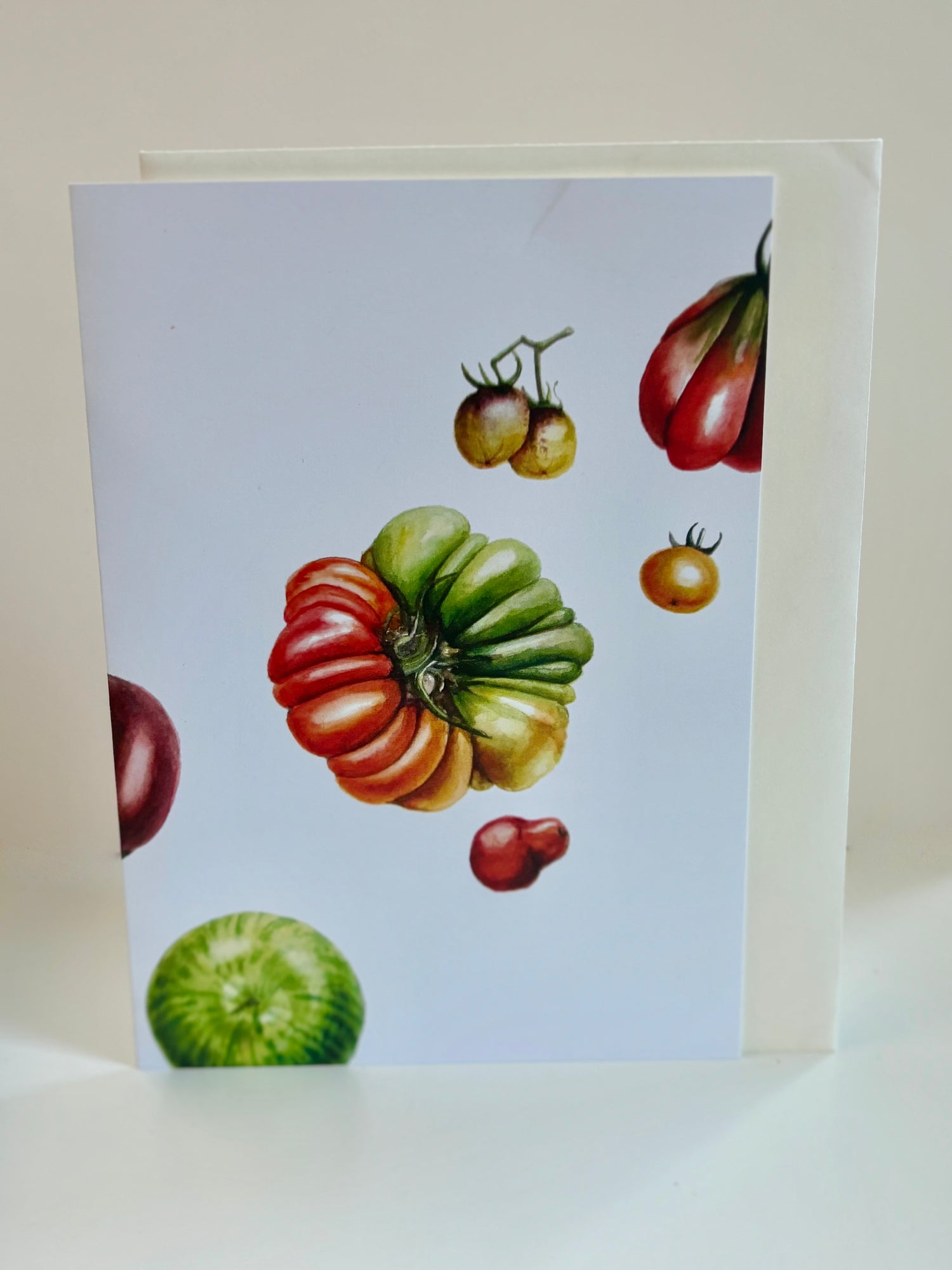
In the illustration of decorative gourds above, I used multiple layers of watercolour in complementary colours to build up the shape and colour of the gourds. Individual areas of colour in the illustration may not match the local colour on the gourds. For example, the orangey yellow on the right gourd appears brown to purple in shadow areas.\

Relative colour based illustrations attempt to show the range of relative colours of a subject. Our brains reassemble these colours into a three dimensional image. This is the same way that we see real objects. Illustrations that employ relative colour appear more three dimensional and realistic.
There are many helpful rules to keep in mind when attempting to paint in relative colours. Relative colours should range from white in the brightest highlights to deep black in the deepest shadows. Generally speaking, colours are warmer in lit areas and cooler in shadow areas. Colours appear brighter and more intense in areas of close focus, and paler further away. In watercolour, relative colour effects can be achieved through layering and underpainting.
If you are interested in learning more about relative colour, then I strongly recommend James Gurney's book Color and Light. It is a wonderful, detailed reference with clear explanations of relative colour and light interactions from basic to very complex lighting, as well as tips for working in a variety of media.
When to use relative colour and local colour
The techniques and style you use in your art should depend on your personal preferences as well as what you are trying to communicate. Look at examples of other artists work to discover aesthetic and communication styles which appeal to you.

Like many botanical artists, I tend to gravitate towards creating three-dimensional looking piece using relative colour. However, I also tend to emphasize local colour just a little bit. Covering slightly more of my subject area with a saturated version of my local colour creates a punchy, bright and bold look.
Since noticing that I tend to emphasize local colour a little bit, I have decided to try embracing it, and create more boldly coloured illustrations.

