Mixing Blue: Painting blue subjects without blue paint
Mixing Blue: Painting blue subjects without blue paint
Last year, I wrote a blog post about mixing primary colours from secondary colours. Since then, I've been meaning to create some paintings that prominently feature mixed "primary" colours. In particular, I've been looking forward to creating a painting of a blue subject, by mixing blue from other colours. Unfortunately, blue plant subjects are somewhat rare! Recently, I found the perfect subject for showcasing my mixed blues.
The Purple Cabbage

 PG7 and PV23 Mixing blue from green and violet
This spring and summer, I've been busy with two things, gardening and The Daily Leaf. A little while ago, I decided to paint a cabbage leaf from my garden for my Daily Leaf project. The young outer leaves of my purple cabbages are a beautiful iridescent steel blue. Depending on angle and lighting, different parts of the leaf can appear purple, deep blue or green.
I took several days to staring cabbage leaves, trying to figure out how to paint them. Clearly, I lead a very action-packed, exciting life.
Many artists would start with a blue base for this mostly-blue subject, with areas of purple and green. This was my first impulse about how to approach this leaf. However, this posed a different set of challenges. Most blue paints are quite vibrant, so I would need to find a way to tone down my blue paint to the steely blue of the leaf.
Luckily, I remembered that many green and violets are great for mixing blue. Mixed blues are usually more muted and steely than single pigment blue paints. Using green and purple pigments to mix blues would also make it simpler to create the subtle colour transitions of this leaf. By varying the ratios of my green and purple paints, I could create areas of different colours that still blended together cohesively.
Finally, I could show a practical use for mixing blue from secondary colours!
Choosing a Palette for Mixing Blue
 Colour Palette for Purple Cabbage
Once I figured out my basic strategy, I just had to choose the specific colour palette I would use for painting my blue cabbage leaf.
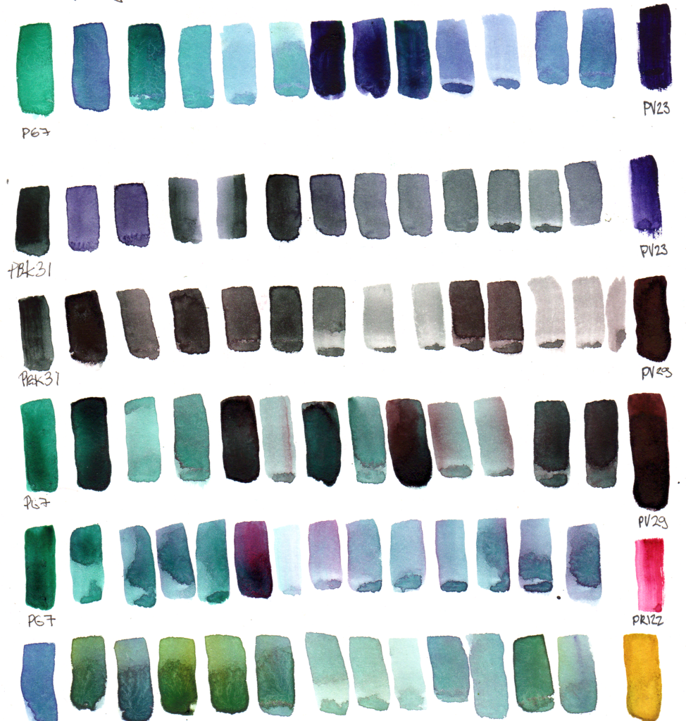
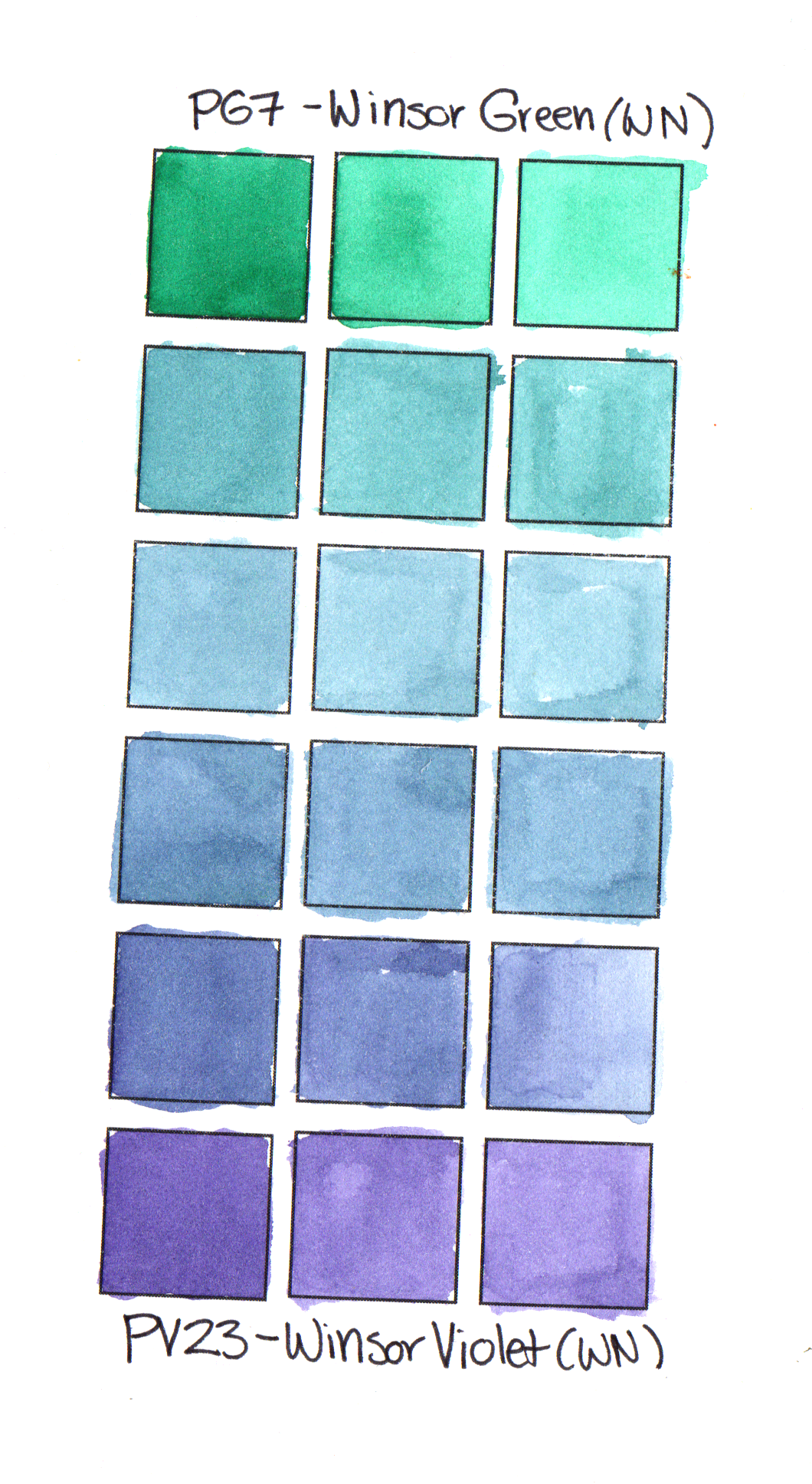
First, I chose a green and violet to make up the main body of the leaf. I started with the bright saturated duo of Winsor Green Blue Shade (PG7) and Winsor Violet (PV23). On their own, these two paints are very saturated and bright. However, together, they mix a range of slightly muted yet deep and interesting blue, teal and violet colours. The vibrancy of this duo breathes life into the finished painting - areas of brighter colour keep mostly muted colour from looking dull.
My main two colours are deep enough in masstone that I could have used them for shadows as well. However, I also included a more muted and even deeper green/violet duo to add depth to the deepest shadows. For shadow colours I chose Perylene Green(PBk31) and Perylene Violet (PV29).
I chose a brighter magenta paint (Purple Magenta PR122) for the contrasting veins. I also used a touch of magenta in some areas of the body of the leaf to add a touch of warmth to some of the blue-violet areas.
Finally, I added the tiniest splash of my favourite yellow pigment, Nickel Azo Yellow (PY150) to my palette. I added this to some of my mixes to create the warmer green around the edges of the leaf. As Nickel Azo Yellow and Phthalo Green create garishly bright neon greens, I actually mixed the yellow with my mixed blues (green+violet) rather than any green alone.
In the mixing page below, you can see some of the mixes that are possible with this palette
 Mixing blues from green and violet + other mixes used in blue cabbage leaf watercolour painting[/caption]
The Finished Product
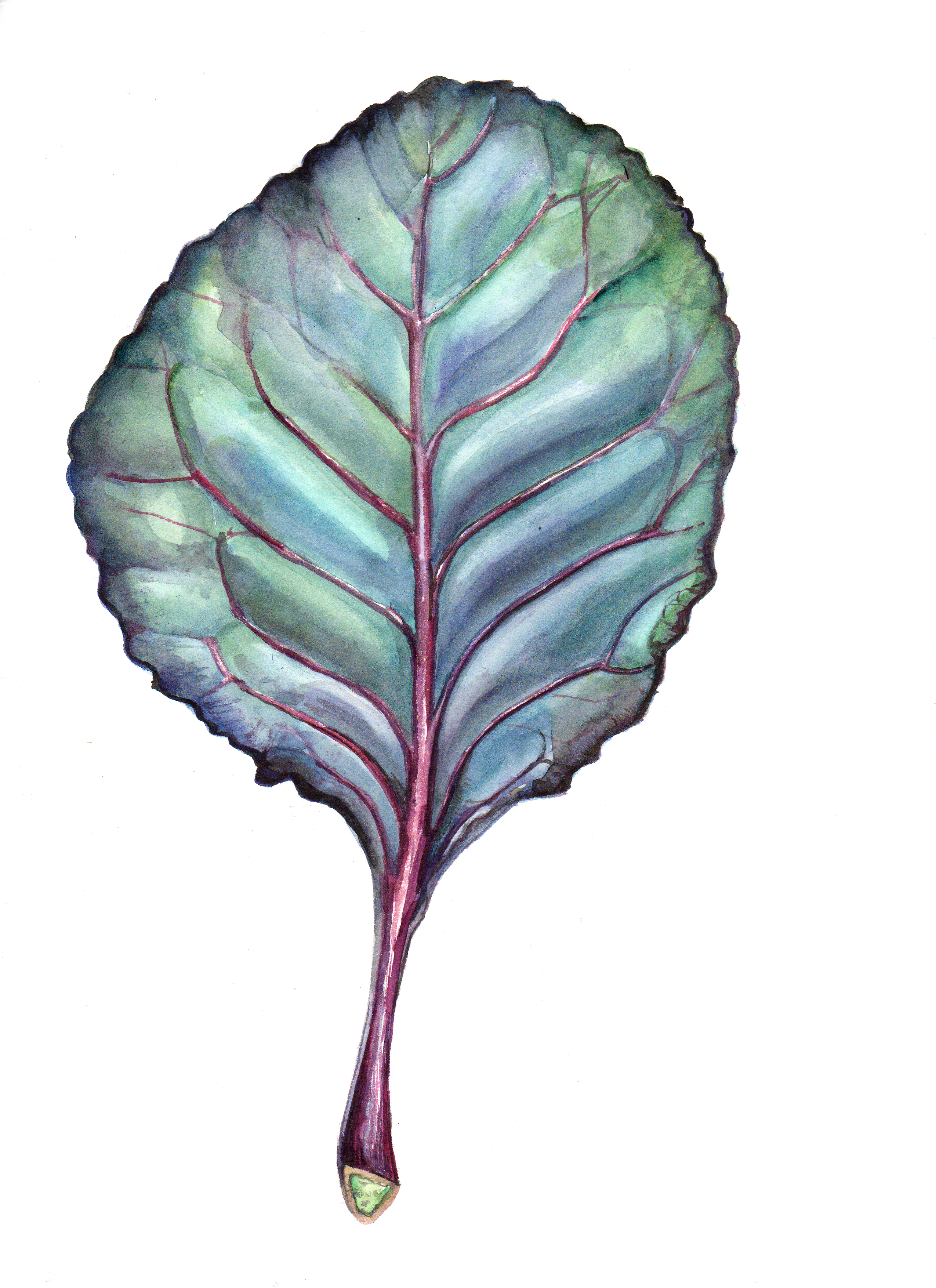 Daily Leaf 178: Purple Cabbage Leaf (Brassica Oleracea) in watercolour
Using only green, violet, magenta and yellow paints, I was able to create this painting of a mostly-blue cabbage leaf (Brassica oleracea). I mixed and layered different ratios of greens and violets. This created the iridescent blue effect of the finished piece. By adding a few areas of warmer green and deep dark mixed blacks, the main colours of the leaf popped out even more.
Will you try mixing blues from secondary colours?