Da Vinci Professional Watercolor Paints
Da Vinci Professional Watercolor Paints
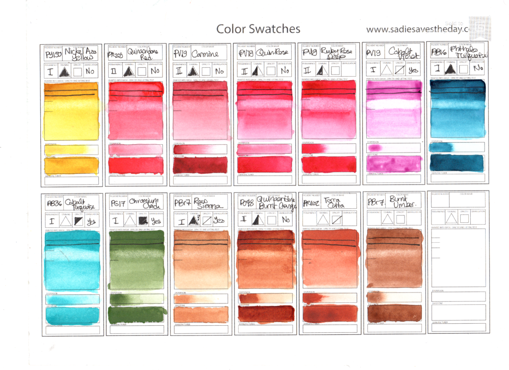 Da Vinci Professional Watercolor Paints - Swatch Sheet
I recently added quite a few watercolour paints to my collection from a brand I was previously unfamiliar with, Da Vinci Paint Co. These paints are not available in my local shops or through my favourite online store, Jackson's Art. One of the local retailers, Curry's, did carry them online(not at their local shop) but recently discontinued them. Their clearance sale price was incredible. I bought a large selection of tubes.
My new Da Vinci paints were a very pleasant surprise. I swatched all my Da Vinci paints on the swatch card above. My swatch card is purchased from fellow artist Sade of Sadiesavestheday.com and printed on Fabriano Artistico Hot Press paper. As you can see from my swatches, these paints are very bright and saturated. This scan is fairly true to the colours of the paints, although the raw sienna has a pleasant warm yellow tint which my scanner stubbornly refuses to catch.
Da Vinci paints are made with a vegan binder which dries to a hard but not brittle consistency and rewets readily. The paints vary in consistency between different tubes/pigments. The cobalt colours (Cobalt Turquoise and Cobalt Violet) both has a stiff, stringy consistency out of the tube which I have not seen before, while the quinacridones were quite runny. However, all the paints set and rewet equally well.
I bought both new colours to try, and pigments I know and love. I already had a Da Vinci Quinacridone Burnt Orange, which I'd bought to replace my loved-but-misbehaving M. Graham Quinacridone Rust. I added my other favourites Nickel Azo Yellow (PY150) and Phthalo Turquoise, both lovely versions, as I am running low on both these pigments.
I bought several paints with the goal of reviewing them in upcoming pigment comparison blog posts. Da Vinci has not 2, not 3, but 6 different paints made with single pigment PV19. I was very curious, so I bought 3 to compare (Carmine, Permanent Rose, and Red Rose Deep), along with a Quinacridone Red (PR209) to compare to my Daler Rowney version of this pigment.
I also bought 2 cobalt colours - enough cobalt turquoise to last me a lifetime (37 mL for $9 !!!) and a cobalt violet just for fun. These are both very bright, nearly-neon colours that are semi-opaque and granulating. I also finally took the plunge and decided to try Chromium Oxide green. I often whine about the lack of single-pigment greens, but I've avoided this one due to it's very opaque nature. I probably won't reach for it frequently, but the almost dusty texture of this pigment will be perfect for painting some kinds of cacti, succulents and lichen. Finally, I stocked up on a variety of earth colours.
![]()


In the past month, I have used these paints a fair bit. I've used Da Vinci Paints for quite a few of my Daily Leaf paintings. What I found most surprising working with these paints is how much more lifting they are than some of the other (honey-based) paints I am used to. They be easily lightened from their dry state to bring out highlights. They also have a longer working time, not staining the paper right away, which allows you to apply a larger wash and then lift out the ligher areas. This would be very difficult with some other paints. These are useful properties, especially for beginners.
I often think of choosing a brand to be loyal to. For personal painting purposes, picking and choosing from what's on sale suits me just fine, it does make suggesting paints complicated. I've often wondered whether I could choose a brand and build something like Billy Showell's Sennelier Botanical Palette, except including my personal favourite pigments. This way, I could recommend a palette to students that they could buy all together from one manufacturer. Until now, all the brands I've considered have fallen short. Every brand is either missing some of my favourite pigments, or I don't like their particular formulations of these pigments.
The 4 pigments I watch out for most are PY150 (Nickel Azo/ Transparent Yellow), PB16(Phthalo Turquoise), PR122 (Quinacridone Magenta), and PO48 (Quinacridone Burnt Orange). In my main palette, I have versions of these colours by 4 different brands: M. Graham(PY150), Winsor Newton(PB16), Schmincke(PR122) and Daniel Smith(PO48).
So far, Da Vinci Paint has come closest to meeting my preferences. Da Vinci Nickel Azo Yellow and Phthalo Turquoise are both fantastic. These paints have the bright, saturated tones I look for. They have the added bonus of being slightly less staining, making them easier to teach with. Their Quinacridone Burnt Orange is a little browner than other versions, but still a very nice colour. Unfortunately, while Da Vinci does offer a PR122 paint,"Opus", this paint does also contain fluorescent dye. However, their Red Rose Deep (PV19) is a beautiful deep pink colour. It is slightly deeper than most Quinacridone Rose paints. Either of these other paints would work well in a beginner set. I am considering building a Da Vinci palette to recommend to my students in upcoming workshops.
Da Vinci paints can be ordered worldwide through the Da Vinci website. Their website offers 15 mL tubes, huge 37mL tubes and pre-made pan sets. They also offer a really handy sample set of 24 paint dots.