Advantage of a Cyan, Magenta, Yellow primary triad in watercolour
Advantage of a Cyan, Magenta, Yellow primary triad in watercolour
I'm not a huge fan of thinking in terms of primary colours. I find it unnecessarily restrictive. After all, you can definitely mix primary colours from secondary colours. However, in my palette building series on my youtube channel, I just recommended a Cyan, Magenta, Yellow triad as your first three colours
If you want to mix a wide range of colours using few tubes of paints, some colour selections do provide a larger mixing gamut than others. Specifically, a primary triad consisting of cyan, magenta and yellow will give you the widest possible range of bright colours. What is special about these three colours?
To answer this question, we need to understand how eyes work.
A Short introduction to optics
Our eyes perceive colours with sensors (optical cones) that are each sensitive to a specific range of wavelengths of light. Different species of animals have different numbers of cones, which are sensitive to different wavelengths - bees and shrimp can see colours we can't even imagine. Humans have three cone receptors, these are sensitive to three wavelengths (or colours) of light - red, green and blue.
When two or more receptors both react to a light source, we see an in-between colour depending on how much each receptor reacted - for example, if we see both red and green light equally, we perceive it as yellow. If both blue and red receptors, far apart on the colour wheel, both react without triggering the green cones, we see an "imaginary" colour with no wavelength, magenta.
Cyan, Magenta and Yellow are the three colours of light we see least well - narrow wavelength ranges only triggered at the outside edges where two receptors intersect.

So the primary colours are blue, green and red?
Right about now you might be getting confused. First I said that cyan, magenta and yellow were primary colours. Now I'm saying that blue, green and red are the "primary" colours, the building blocks that we see all other colours from. What gives?
You see, there's a difference between how we perceive coloured light (different wavelengths of light) and coloured objects. Coloured light is a specific wavelength of light (or combination of wavelengths) shining at us. Coloured objects (like watercolour on a paper), are objects that absorb some wavelengths and reflect others. A yellow object, for example, will absorb blue light, reflecting a range of light wavelengths that trigger our green and red cones.
It is impossible to mix a bright yellow from any colours except other yellows (except perhaps extremely yellowish greens and oranges) in paint, because as soon as you choose a slightly different colour, you will start reflecting some blue, or stop reflecting as much green or red, resulting in a mixed colour that we perceive as something other than yellow.
The "primary" colours of cyan, magenta and yellow, in the context of painting, are the colours which we see least well. There's a huge range of different wavelengths and combinations that we perceive as green, blue or red, but fewer that we perceive as cyan, magenta and yellow.
The largest mixing gamut

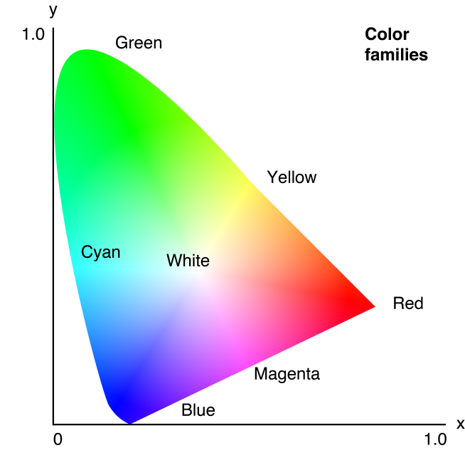
There is an additional factor, which is that our cones are not evenly spaced across the colour spectrum. We frequently represent the range of colours that we see as colour wheels, like the colour wheels above showing the mixing range of different colour combinations. However, our visual spectrum is better represented as this wonky horseshoe shape.

There is a huge range of colours that we can see, but simply cannot include in an object that doesn't emit light, like a painting. Think of bright neon lights.
In the context of the colours we can see and have available as pigments, in a subtractive colour mixing, we cover the largest mixing area as well as the largest selection of named colours by starting with a triad of cyan, magenta and yellow. Although we see a wide range of greens, missing the brightest greens has less of an impact on our perception than missing a yellow.
Will you select a cyan, magenta, yellow triad for your next palette?

