Without fail, at every one of my community shows, whether at KW Artists Co-op or in a local gallery or cafe, someone exclaims that they can’t believe my work is watercolour, because my colours are saturated and my linework so precise.
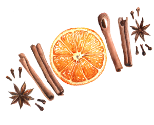
Orange and Spice – Watercolour on Paper
This always makes me giggle a little – in the realm of botanical illustration, a very traditional watercolour discipline, my lines and edges are downright sloppy! I have an interest in realism, and conveying scientific accuracy, but I have very limited patience for ultra tiny brushes and buffing. More patient watercolour artists that I can achieve much much cleaner lines using the same materials.
I love the puzzle of figuring out how all the little shapes in a complex subject fit together, and the thrill of building up colour, but when it comes to using teeny brushes to gently even out my gradations…I’m out. I’m working of finding my ideal balance between an economy of brushwork and preserving accuracy.
My colours are probably on the bright and saturated end of botanical painting, but still a ways off from the limits of the medium. In the orange and spice painting above, for example, the orange could be made even brighter and more juicy looking by gently working in some deeper shadows with small, saturated glazes in the areas of shadow. This would add more depth to the orange slice, making it look juicier, brighter and more three dimensional.
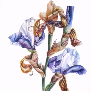
Dutch Iris – Watercolour on Paper by Lee Angold
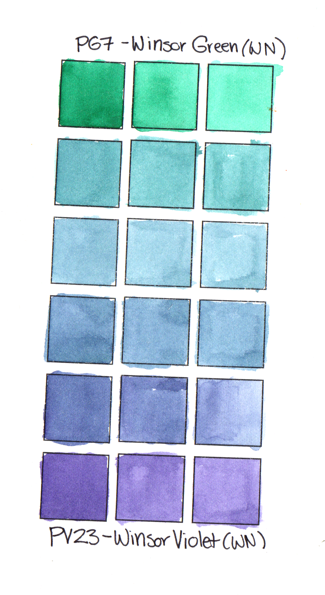
Even amongst skilled watercolour artists in watercolour communities, there seems to be a fair bit of confusion about the properties of watercolour. A couple of weeks ago, there was a thread in one of the big watercolour facebook groups discussing transparency in watercolour. Many skilled watercolour artists were pointing at darker and more saturated paintings as “opaque” vs watery unsaturated paintings as “transparent”.
In fact, transparency is an attribute of the pigments used, not how much water or how light they look. There are very light-coloured, pastel-like opaque pigments and colours (think of gouache), and many of the most transparent colours appear very dark in masstone. When using transparent pigments, you can keep adding layers of the same or different pigments – each layer will be transparent and visually mix with the layers beneath, creating a darker and more complex colour. This is a way to use watercolour transparency to build up extremely saturated colours and delicate colour gradations.
In reality, what watercolour is, above all, is a very flexible medium. Dry artist-grade watercolour, whether in extruded pans or sticks, or just dried from a tube, is very nearly pure pigment, with just enough additives (gum arabic and/or honey and ox gall) to make it stick and spread smoothly. Being infinitely rewettable in plain old water, it can be thinned just a little to a thick, syrupy, ultra-saturated consistency, or watered down until it is barely tinted water.
Once applied to your paper or other support, more layers of thick or thin pigment can be added on top, again and again, building up deeper, darker and more complex colours. Alternatively, very delicate, watery washes can create an ethereal, wispy look, adding form to delicate light-coloured subjects or giving a dreamy look to a whole piece.
Creating sharp lines in watercolour is also easy. Using the point of a barely damp brush on smooth hot press paper, you can create lines more precise than even ultra sharp pencils. Watercolours will not spread where there is no water, so you can “paint” complex edges with plain water before applying coloured wet-in-wet washes to define the edges of a coloured shape. While your paint is still wet, you can apply a dry or damp clean brush to lift out highlights or soften ragged edges. Using these techniques, and building up colours in layers, you can achieve realistic effects and complex colour mixes that are much trickier to achieve in opaque or thicker media such as acrylic or oil paint.
Some artists push the flexibility of watercolour even further. I recently saw some paintings by an artist (who I can’t seem to track down) who makes really impressive textures in watercolour urban sketches using very thickly applied paint and a stick to scrape out wet pigment. The result looks like a textured resist – almost as though the painting was stamped in blocky colours on a support painted with wax.

Coneflowers by Candice Leyland
Wispy, ethereal, soft and unsaturated watercolour paintings are beautiful. I love looking at my friend Candice Leyland’s paintings, which all convey a calm, dreamy mood.
However, if you take a closer look at her work, and other loose watercolours, you will see that most loose watercolour paintings still have areas of sharp lines and some deeper shadows. The same techniques of washes and dry strokes, applied repeatedly in precise glazes over a painting to preserve highlights, result in a punchy and precise/realistic painting.
There is not a “right” way to use watercolour paints. Watercolour is a flexible medium that works well for loose, impressionist and watery looks, as well as fine and precise layered looks. All sorts of artists can benefit from the ultra-portable, infinitely rewettable, easily mixable attributes of watercolour paints.