I’ve recently started making a very conscious effort to restrict my colour palette (in individual pieces and sketch kits, my overall watercolour studio palette is still a 50+ pigment smorgasbord, my coloured pencil collection is even larger, and I love it).
My usual studio setup – 52+ pigments in my studio palette, about 3-5 paints make it onto my mixing surface
The goal is both to practice more conscious colour mixing, and to train myself to make more deliberate and informed choices about colour and light interaction. These are more broadly described with the term colour harmony and cohesion, but like many abstract concepts in art, have a strong scientific basis.
Colour harmony is one of these “fuzzy” subjective topics in art that I really didn’t “get” for a long time. Many artists extole the virtues of a limited palette for creating a “cohesive” look within their paintings, but each artist had different and conflicting suggestions for essential pigments. In addition, doesn’t the real world contain all of the visible colours? In a world with all the colours, what is a “cohesive” look anyway? Wouldn’t it be better to have every colour at your disposal?
Reality is quite a bit more complex. The colours we actually see are affected by the colour of light, as well as reflected colour from surrounding objects.
Our eyes play tricks on us – for instance, we know a ripe banana is a bright, middle yellow, but in a dark room, in a fruit bowl surrounded by dark red fruit, the “correct” colour to paint a ripe banana for realism might be a neutralised orange, such as an ochre or Quinacridone Burnt Orange. It took me a while to understand is that in this case, it wouldn’t just be “cohesion” or “harmony” that would be disrupted by painting a bright yellow banana, it would actually not be a realistic depiction of the banana.
Our eyes are actually even tricksier than this – humans actually only have “good” colour accuity in a very narrow cone. We do have a fair bit of peripheral vision outside this cone. Our brain fills in the edges of our vision with colours to match what we see in front of us, then edits our memories to correct any inconsistencies as we look around. Part of the reason a painting with a very bright pop of colour all the way to one side, which doesn’t appear elsewhere, is considered a “bad” or “uncohesive” composition is because this is not how we actually ever see the world.
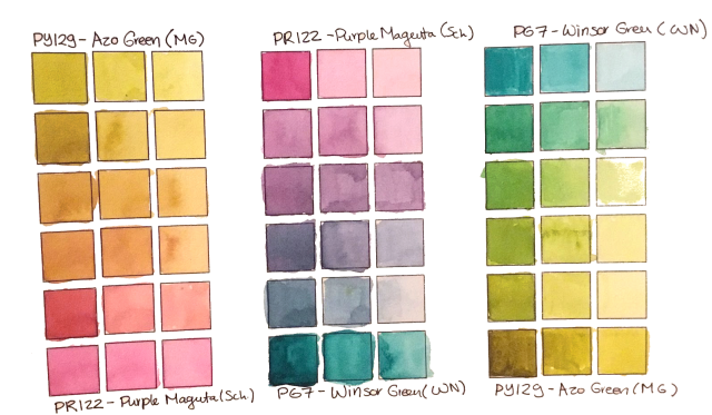
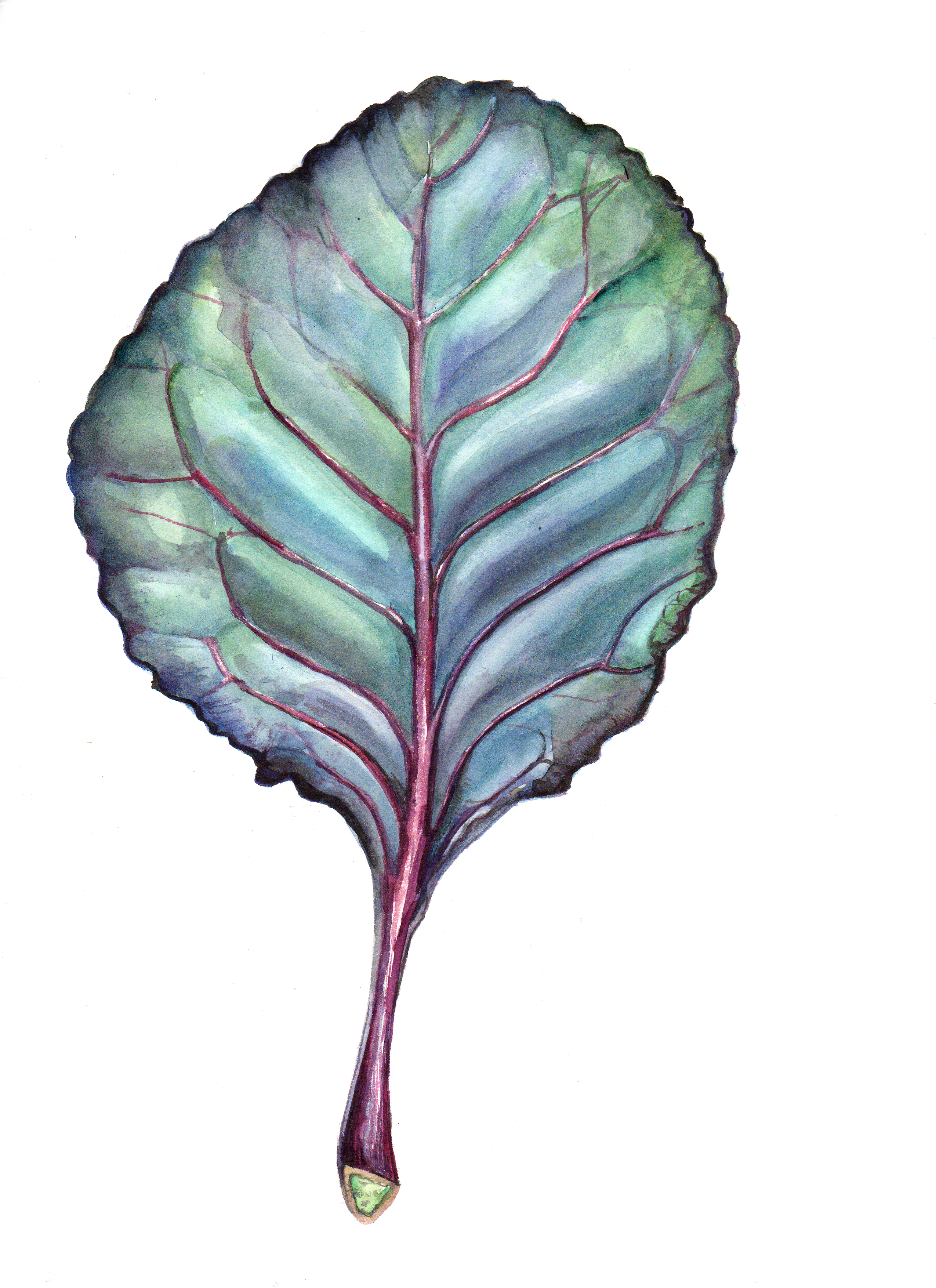
Two Greens and a Magenta – An effective colour palette for tomato plants?
In a way, choosing a very constrained colour palette is an effective way to mimic real lighting/environmental conditions as we might see them. Take, for example, the limited colour palette above, where I chose a magenta (PR122) and two greens – a cool almost-turquoise PG7 (Winsor Green BS) and a warmer PY129 (Azo Green, or Green Gold). This palette produces a surprising gamut of slightly neutralized warm colours from reds to rusty oranges and plums, as well as some eye-poppingly bright greens. It might be a great colour palette for rendering berries or tomatoes shades by sunlit leaves – in fact, I am planning to paint these very pieces using primarily these colours.
And then, of course, there is the matter of using colour selection to draw attention to a specific element within a composition, or to evoke a mood within a collection or body of work. I’ve recently started taking online courses with the School of Visual Storytelling (SVSLearn), and was struck by the strong focus on manipulating colour and light to help with storytelling.
An illustrator who I think has a really stellar grasp of limited palettes for communicating mood and lighting is Ira Sluyterman van Langerweyde (Iraville). Her studio palette rivals or exceeds mine, but she regularly uses a very limited, and fairly consistent subset to create a cohesive, whimsical, warm and natural-looking collection of playful illustrations.
In the field of botanical and scientific illustration, we are somewhat shielded from all of these concerns. Botanical illustrators draw close-up, isolated subjects under bright, white light, specifically in order to communicate details of the individual subject without influence and distraction from surrounding scenery. We don’t have to worry about the colour of ambient light, because we choose white light. We don’t have to worry as much about competing colours with limited subjects, and can manipulate our composition without worrying about impacts on surrounding elements. We use neutral backgrounds and are specifically discouraged from using cast shadows.
Nonetheless, I have found that the most successful scientific and botanical artists and illustrators, and the ones I admire the most make both deliberate and subconscious choices about lighting, colour, and subject selection which are very helpful in creating eyecatching, striking compositions.
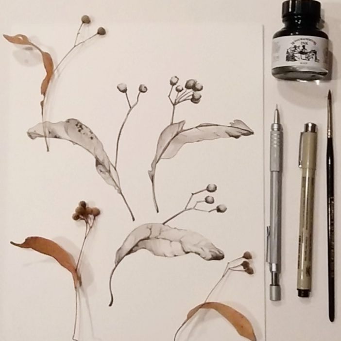
This can play out within individual pieces, where artists choose to highlight the unique characteristics of their subject – in my lichen on elm bark image in my header image, I really loved the stark, graphic white look of the cup fungi, and chose my colour balance in a way that would highlight that graphic, almost comic look, choosing to neutralize most of the greenish-gray crustose lichen and tree bark, but pump up the colour in the pops of green, rust and ochre.
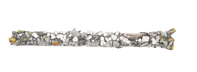
Cup Fungi and Lichen on Elm Branch – Coloured Pencil and Micron Pen by Lee Angold
On a broader scale, even realist artists develop a colour “brand” or “colour signature” across their body of work. As an example, Anna Mason’s brightly lit, vibrant fruits and florals have a very different look from Jess Shepherd’s dramatic and earthy leaves and vegetables, although they both make large-scale, realistic botanical paintings.
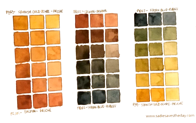
Muted, earthy triad – Spanish Gold Ochre, Salmon and Mayan Blue
Inspired by Iraville and other illustrators I admire who I have noticed use similar colour palettes, I thought it would be fun to create an earthy, natural triad to try sketching with or using as a base for some earthier subjects (obviously, this will never be an appropriate palette for very bright citrus or purple flowers I used my new paints from Pruche along with Mayan Blue from Rublev, which is bluer than it appears in this image but still very dark and muted. I generally prefer much brighter, clearer colours, especially greens, but I think this is an interesting jumping off point, in particular urban sketching and simple studies.
I’ve been spending a lot of time poring over James Gurney’s book Color and Light, which is fantastically detailed with loads of visual examples about different lighting situation, how they affect colours within a painting, and how they can be used to communicate mood and focus within a painting. I particularly enjoyed the chapter on gamut mapping. In future posts, I’ll be exploring pieces created with a limited palette, and sharing the gamut mapping for each of them.