Originally, I was going to give this blog post a much more clickbaity title, “There’s no such thing as primary colours”.
Green + Violet = Blue ?!?
In this post, I will discuss why everything we’ve been taught about primary colours is an oversimplification to the point of being wrong. You can actually mix so-called “primary” colours from secondaries. And on the flipside, no matter which set of 3+ colours you assign as primary, I can find you a shade that cannot be mixed from them
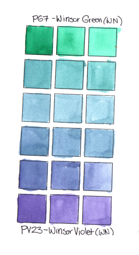
As a first example, take a look at my spectrum mixing chart to the left, mixing Winsor green with Winsor Violet. According to every lesson on colour mixing I’ve ever seen, these are secondary colours.
If your primary school was anything like mine, you were taught fairly early on about the concept of primary colours. Sometime in kindergarden, or maybe it was first grade, we were taught that there three primary colours that can’t be mixed, from which all others can be mixed, and shown a beautiful colour chart.

Yellow, Red, Blue Primary mixes
In this first class, we were also taught that these three colours are Yellow, Blue and Red, and then asked to mix a pie chart with the secondary and tertiary colours.
I dutifully completed this exercise, and like most of you, was dissapointed my result looked nothing like the example above. Most of the mixes looked grey or brown.The flustered teacher comforted upset kids, assuring us it was not our fault the mixes came out muddy.

CMY colour mixing, from John Muir Laws
Some years later, perhaps in middle school, the same exercise was brought up again. We were told the “primary” colours we had previously been taught didn’t work well because they weren’t the real primary colours, cyan, yellow and magenta. With cyan, magenta and yellow, we really could mix every other colour. Perhaps this was even paired with a lecture about additive and subtractive colour.
Once again we were asked to mix colours. This time, the mixes did come out somewhat cleaner, but I was still wasn’t quite satisfied. I could not, for the life of me, mix a pure, non-neutralized ultramarine blue, or the brightest greens.
Finally in high school and beyond, we were taught the concept of split primaries, where instead of 3 primary colours you have six (a warm and cool yellow, a violet-blue and a turquoise, a red and a magenta), but by this point, I had lost all faith in the concept of primary colours.
Where does the concept of primary colours come from, anyway? In pure physical terms, colours are just a continuum of wavelengths of light in rainbow order (ROYGBIV) There are no colours with special “primary” distinction.
There are, however, wavelengths of light that we distinguish better than others. Our eyes have 3 colour receptors (red, blue and green) which each record light within a band of wavelengths and an intensity receptor. Our brains interpolate intermediate colour in the overlaps between these receptors (so what we perceive as yellow is a colour in the very narrow band between the extremely far apart green and red receptors where both are fired. When both blue and red are fired we interpolate violet and magenta- magenta doesn’t even have an associated wavelength – it is the halfway between red at one end of the visible spectrum, and violet all the way at the other.
By wrapping that line of wavelengths around on itself, we create a “colour wheel”. In actual fact, a wonky horseshoe/triangle might be a more accurate representation in 2D space of the colours we really see. However circles are more satisfying and easy to understand than wonky horseshoes, so colour wheels it is.
On this colour wheel, you can pick any two colours, they don’t have to be primary colours, and mix them together to get colours on the line between them. Mix a yellow and a magenta together, and you will get an orange (albeit a less saturated orange than the brightest orange you could see). Likewise, mix a violet and a green together, and you will get a blue, albeit a muted, dusky one. There are many resources, such as the one below by Bruce McEvoy of Handprint, which map common pigments onto a colour wheel.
You can easily map out the area you can mix with any given palette of 3 or more colours by drawing lines between the pigments you are using. The area enclosed is the colour gamut you can mix. No three colours can actually mix all of the visible colours, however, they may be enough to render the subjects and lighting you are interested in representing.

So what makes primary colours special?
Our most accurate “primary colours”, in terms of paint (as opposed to emitted light) are in fact the midpoints between our three colour receptors placed on the colour wheel. In other words, what we commonly consider primary colours: magenta, cyan and yellow, are actually the 3 colours we see least well.
While it seems backwards, when explained in words, that our primary colours are the ones that we don’t see very well, there is a good reason for this.

In the image to the right, you can see the results of the XKCD colour survey. People were asked to name colours on a computer screen generated from RGB codes. As you can see, the range of different colours we perceive as green and blue are huge compared to what we label yellow.
It is therefore very easy to mix an acceptable “green” from yellow and cyan or blue. Mixing the “primary” colours, however, is a little bit trickier, as the target is much narrower
 Cyan, or blue, (as there are no true cyan pigments artists usually substitute a blue or teal), is probably the easiest of the primaries to mix from secondary colours. Any bluish-green with purple mixes a satisfactory range of teals and blues.
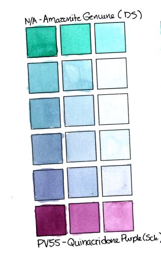
You’ve seen my PG7 and PV23 example above. In case you thought that was a fluke or something to do with the specific pigments, here’s another example, mixed with Amazonite Genuine (DS) and Quinacridone Purple (PV55).
But this really does work with any colour to some degree. Let’s take the example of the red/magenta area. You can, of course, mix a red (in the grade school “primary” sense of the word) from magenta or rose and orange or yellow. We’ve all done this.
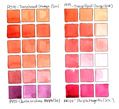
However, you can also mix an orange with a violet to get magenta. You won’t get a clear, pure PR122 Purple Magenta colour, of course (just as you won’t get a clear, vibrant green mixing a far apart yellow and blue), but you will get a magenta colour saturated enough to work as a “primary” in a muted palette. The spectrum charts on the left are a little overexposed – my scanner does weird things to oranges, but you get the idea.
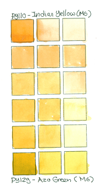 Finally, the hardest primary colours to mix (and get my scanner to show properly) are yellows. Anything but the purest, most saturated yellows read as brown, olive or orange to the average observer.
To mix a yellow, my first attempt actually included two “secondary” colours actually in the yellow colour index. PY129 (Azo Green, or green gold, a very yellowish green) and PY110 (Isoindoline or Indian Yellow, more of an orange at full saturation, mix to make closer to a primary yellow.
My scanner really shifted the masstone of my Azo Green, which truly does read as a green or chartreuse in real life, but the mixes in this spectrum are fairly close on my monitor to their real life colours.
In colour mixing, think beyond “primary colours”. Sometimes the blue you need is most easily reached by mixing green and violet. Sometimes the “secondary colour” you need cannot be mixed from the “primary” colours you have available.