As I mentioned in my Watercolour Palette Tour teaser post last week, I recently received some watercolour trial dot cards of Schmincke Horadam watercolours.
I do already own a few Schmincke watercolours – Purple Magenta (PV122) and Translucent Orange (PO71) are in my “greatest hits” palette. I also keep Schmincke’s Ultramarine Finest (PB28) in my larger studio palette – although I don’t love PB28 in, it is such a ubiquitous pigment that I do want to have some around. I do find this smoother, less granulating version less aggravating than most.
In general I had been impressed with my Schmincke watercolours. The Purple Magenta and Translucent Orange are both unique, brilliant, beautiful colours with fantastic mixing and layering properties. All three pour buttery smooth into pans, set nicely and rewet beautifully. However, since Schmincke is such a hard-to-find, expensive brand in Canada, I only have a few tubes that other artists had recommended as standouts from the line. I was thrilled to see them offering trial sheets, so I could find out how the rest of the line compares.
In addition to the 12-colour card I already blogged about, I also got a a trial sheet of the 35 new colours they released in celebration of their 135th anniversary, and a large 80-dot set. I also snapped up some small tubes of Cobalt Blue Deep (PB74) and their newly released Quinacridone Purple (PV55) and Phthalo Sapphire (PB15:6) in the same (135-year!) anniversary sale where I got the dot samplers.
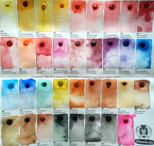
I had hoped that that the 80-colour and 35-colour would be completely different sets (adding up to almost the full range of 139 colours Schmincke now offers), but alas there was substantial overlap, so I missed out on a number of interesting pigments, including the Translucent Brown I was particularly excited to sample. Schmincke does produce a 135 colour dot trial sheet, which was out of stock. Perhaps someday I will buy that one.
According to Handprint, Schmincke is a popular brand among botanical artists “for their consistent texture and less emphatic chroma”. I’ve heard the same sentiment echoed by other artists. With only a few paints, I couldn’t really comment on consistency, and “less emphatic chroma” is not a word I would use to describe Purple Magenta or Transparent Orange, even alongside my eye-scorchingly bright M. Grahams. After painting out swatches from the large trial sheet (and squeezing my new paints into pans), I have a much better understanding of what they mean.
Schmincke Horadam are exceptionally well-behaved paints. These are stern, precise, German paints.
All 6 of the tubes I own have squeezed out neatly with a creamy, even consistency, and then settled into looking like smooth, shiny little candies, which all rewet neatly and are never sticky. This in comparison to my M. Graham paints- which glob out unevenly into sticky, unsightly mounds in my palette which eventually dry but never look smooth, or my Daniel Smith and Winsor Newton paints, which crack as they dry or pop out of the pan entirely.
In terms of the behaviour of the paints themselves, particularly in the dot set, I was struck with how all of the paints behaved similarly. Whereas in some brands, like Daniel Smith, granulating paints will create wild crater-like patterns and staining paints will be prone to dramatic backruns, this effect was barely noticeable across most of the Schmincke line, with the exception of a few of the newest additions. Granulating paints left delicate granules in place. Staining paints painted out evenly, and stayed put where they were brushed in. The colours seemed about as saturated as Winsor and Newton or Holbein overall, although the range of saturation was less pronounced (the phthalos less overwhelming, cobalts and earth tones more saturated).
The Schmincke line does include a few very bright, brilliant, high chroma colours.However, although these are all bright and well-pigmented, they do not overwhelm mixes as much as some of my M. Grahams or even the Winsor Newton phthalos.
Having swatched out these paints, I can certainly see why many botanical artists would appreciate this controlled, predictable behaviour. In very detailed, technical work where precise colour mixing is desired, one does not want to worry about a stray puddle of phthalo green eating your palette whole or crazy textured bumps appearing in your smooth flowers because your ultramarine granulated over-enthusiastically. Schmincke definitely delivers a consistent, reliable, user-friendly product.
For most of my painting, I am addicted to the wild ride of the most saturated, highly staining, brightest colours and the responsiveness of honey-based paints. However, I do find the idea of putting together a cohesive palette with similar hues to my current favourites, but all in nicely-setting, evenly mixing formulations appealing. Occasionally for delicate subjects, or in a travel context, it might be nice to have better-behaved alternatives, so I looked carefully at the Schmincke offerings of my favourite pigments.
My current primary triad is Schminke’s Purple Magenta (PR122), M. Graham Nickel Azo Yellow (PY150) and Winsor Newton Pthalo Turquoise (PB16). Given that my choice for magenta is already Schmincke, I was particularly interested in Schmincke’s PY150 and PB16 offerings. I was not impressed with either one. Whereas the M. Graham PY 150 looks like bird poop in the pan but washes out to a brilliant primary yellow, the Schmincke looked smoother concentrated but didn’t achieve that clear pure yellow look even in tints- always looking a little brownish/earthy, not a great choice for a primary/main yellow. And while the PB16 was a lovely colour in tints, it did not appear to be as concentrated as the Winsor Newton, which is nearly black in masstone.
Other favourites were also dissapointing. PY129 did not have the lively green masstone of M. Graham’s green gold, instead appearing more brown. PB60 Delft Blue was the gorgeous blue of cobalt glass when wet, and I was very hopeful, but when dry it looked ashy and greyer than both the M. Graham and Daniel Smith versions.
However, the dot cards did introduce me to some other offerings which I may soon add to my collection. Schmincke has quite a range of pleasingly bright and transparent colours in the red/rose/coral family. I am also hungrily eyeing the absolutely yummy version of PG50 Cobalt Teal. I currently own this pigment in QoR, which is nice from the tube but I don’t like the rewetting behaviour of. The Schmincke version is prettier, brighter, and rewets beautifully. I may even spring for May Green, which is the happiest bright green (gasp! a convenience colour).