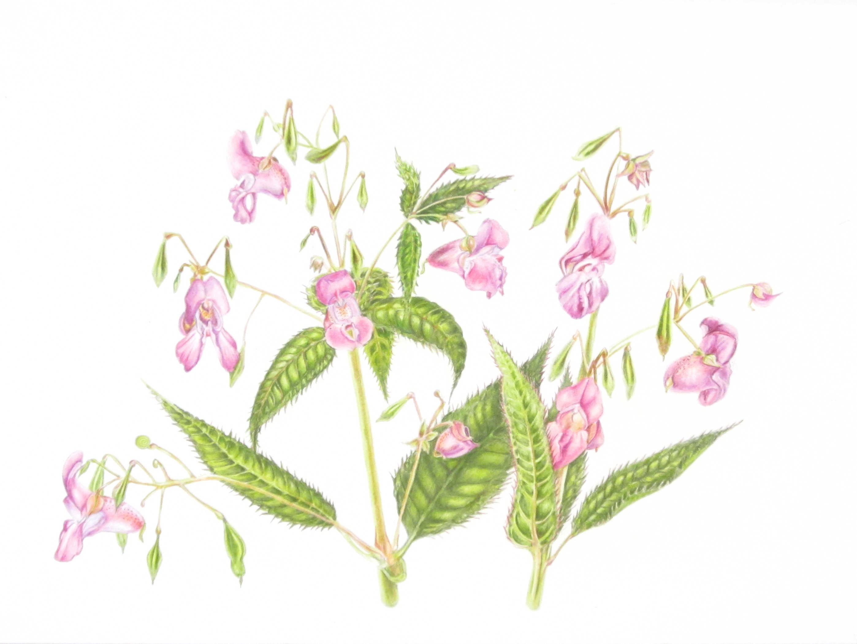
I’ve been thinking a lot lately about defining my own personal style in art. I know a few things – I strive for fairly accurate, realistic art. However, I do not like my art to be too delicate or technical. I really like quirky subjects, bold contrasts and colour.
The past few weeks, I’ve been working on painting carrots. Orange carrots are boring, so I’ve added in carrots that are purple, green and yellow to make a spectrum – a literal rainbow of carrots. This was originally intended to be an assignment for the SBA diploma course in coloured pencil, but after some initial sketches and colour swatches, I decided to complete it as a personal project in watercolour instead. I think it will look great on greeting cards for spring.
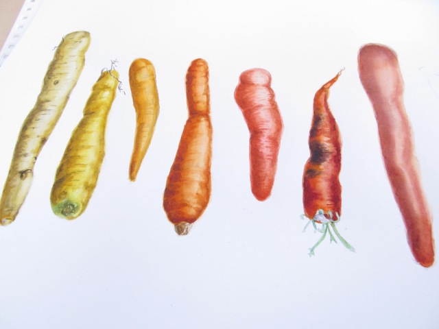
Taste the (Heirloom Carrot) Rainbow – Work in progress
I’ve been focused on showcasing the things that make heirloom carrots unique. I’ve chosen the most colourful carrots. I’ve been drawing them under a warm light and bumped up the colour saturation and contrast just enough to make the rainbow pop. Carrots are knobbly root vegetables, and I’ve spent time developing all of the bumps and blemishes and hairs to make them extra carroty.
The whole time, the sentence “She drew carrots that look even better than real carrots” has been running through my head. It’s an adaptation of a line from an old favourite children’s book appropriately named Purple, Green, and Yellow, by Robert Munsch. The main character, Bridget, collects hundreds and thousands of markers, which she uses to draw “roses that look even better than real roses, oranges that look even better than real oranges”, until she gets bored and draws all over herself.
I decided I was going to be an illustrator when I was very little. One of the first things to spark my interest in illustration were the wonderful illustrations in the children’s books my parents read to me. Robert Munsch took up much of our library, perhaps because his characters reminded my parents so much of our own family. Michael Martchenko‘s illustrations of Munsch and his kids in Something Good are a comically accurate caricature of my own dad and siblings, from the mannerisms to the eyebrows.
http://foundationforeducation.ca/wp-content/uploads/2012/08/Munsch-image.jpg
The character who I identified most with was not any of the kids in Something Good, however. I was most like Bridget, the little artist who uses her collection of 500 permanent markers to draw on herself in Purple, Green and Yellow

I’m still that little girl in many ways. I don’t have quite 500 indelible markers (only about 50 Copics) but my collection of coloured pencils might soon exceed 500. I also hoard other art supplies – a few dozen tubes of watercolour paint (including sparkly amethyst coloured paint made from REAL amethysts), pens, watersoluble crayons, ink, graphite…
I don’t often use them to colour on myself anymore, but “carrots that look even better than real carrots” is very much an accurate summary of what I try to achieve with my work. I don’t know if I’ll ever quite hit the mark, but I hope to be able to draw, say, carrots, in a way that makes you want to pick the carrot off the page and bite into it, even more so that a real carrot.
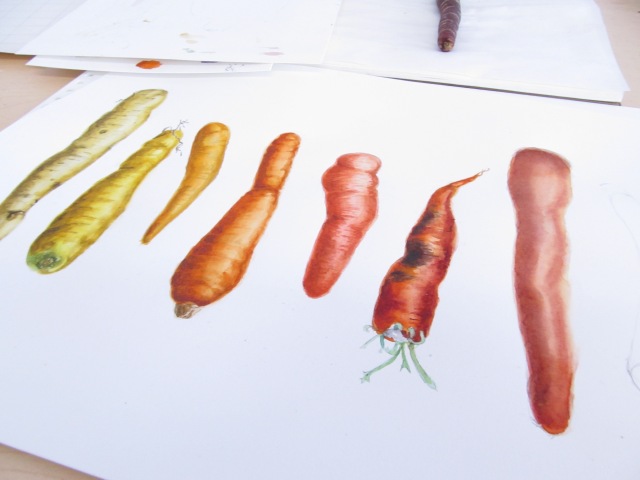
You can juuust see the edge of a real carrot I am using for reference in this shot, how am I doing?